CRASH is a rare beast among magazines — everything short of
the printing is done by a small team based in Ludlow, Shropshire. Here’s a
short tour of the process, from writing to the final details of
design.
To 300,000 readers, CRASH’s public face is its writers — and
none is more written-to than Playing Tips Editor Nick Roberts. Spending hours
at the Towers after school every day, Nick tests all the tips and POKEs that
arrive (well, nearly all...) and files them for future use.
Choosing each month’s maps is a task too — there’s never enough space, and
that’s the perennial complaint of writers and editors (except when the deadline
is really close and they start complaining there’s too much space to fill).
Meanwhile, other writers at the Ludlow headquarters are working on reviews
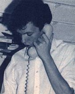
and features, while out-of-house columnists like Philippa Irving and Simon N
Goodwin slave away over hot Spectrums in their own corners of the country,
phoning in occasionally to discuss what they’re writing.
And as the games come in for review, photographers Cameron Pound and Michael
Parkinson hurry to get the screenshots taken — always shooting as many as
possible in case the game’s an unexpected Smash!
The writers may be the magazine’s public face, but between the
writers and the printed words there’s a series of editors. Usually a finished
article goes first to Subeditor David Peters, who corrects any mistakes,
double-checks with the writer if something doesn’t make sense, and often has to
cut the piece to fit the allocated space.
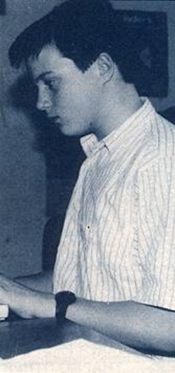
Then the polished product comes to Managing Editor Barnaby Page (pictured),
for a final read-through before it goes on an Amstrad disk and down the road to
Tortoise Shell Press, a local printing company which typesets all of CRASH,
ZZAP! 64 and THE GAMES MACHINE.
Besides choosing pictures, writing sarcastic captions and hurrying everyone
else, Barnaby also puts typesetting codes in the article so it comes out in the
correct size and typeface — blame him for the occasional
mi stakes Like Ωthis.
Copy (the journalist’s and ad man’s jargon for written material)
comes back from the typesetter on bromide paper in long strips of text. It’s
photocopied so the editors can check for any mistakes — you always miss
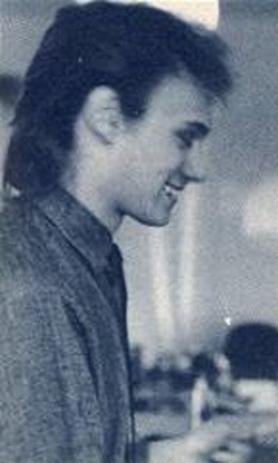
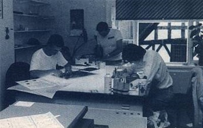
something on the screen, somehow — and sent up to the Art Department where
designers Markie Kendrick (pictured) and Wayne Alien make it look like a
magazine. They stick the strips of text down on boards the size and shape of a
CRASH page, saving spaces for pictures, blowing up (enlarging) or reducing
(shrinking) headlines on a process camera, and remembering all the fiddly bits
like keylines (the lines that separate parts of the page) and page numbers.
Black-and-white pictures are made into photomechanical tints (PMTs) on the
process camera — because mono photos are made up of every shade from black to
white, but a printing press can only handle solid black and solid white. A PMT
is made up entirely of minuscule black dots and white dots, so it can be used
for printing, but it simulates shading by subtly increasing the concentration
of black dots as an area grows darker. (If you look at any of the pictures on
this page through a powerful magnifying glass you’ll see exactly how it works.)
When all that’s done the patches arrive — single lines or paragraphs of text
typeset again with mistakes corrected. They have to be stuck down in the right
place, and sometimes it’s a race against time to get the corrections in.
Finally, the page is ready for colour mark-up... and by now someone in
film-planning is probably breathing down the Art Department’s neck.
The film-planners add colour to pages. Every bit of coloured
text or background (photos are a different story) is a combination of magenta
(a purplish red), cyan (green-blue) and yellow in different strengths. Those
three form a set of primary colours, so any colour can be created by mixing
them in different strengths.
The Art Department’s designers mark each page with the mixture of colours
required — for instance, the Forum page on the back of this was marked ‘50%
yellow, 30% magenta’. (It’s just a colour cocktail, really.)
Then the film-planners prepare a film for each of the three colours, by
masking out the bits that aren’t that colour and shooting it on a special
camera. Another piece of film is shot for the ordinary black text and keylines.
And all that’s done for every page.
But the millions of shades on colour photos are far too complex to do by
hand, so they’re sent to Scan Studios in north London where a laser-scanning
machine does the same job, producing those four films (called separations) for
each picture. The separations come back to Ludlow where they’re slotted into
the page’s film.
When every page has been shot to film, the issue ‘goes to bed’ — work’s
finished for the Ludlow team (except the Production Controller, standing by to
deal with any last-minute printing problems — and the accountants waiting for
the money to flood in!) We send those films to Carlisle WebOffset, they run off
130,000 copies and... Here it is.